Detailed Sub-State Summaries of Where Health Care Workers Live and Work
This dashboard allows for comparison of where health care workers live and where they work using a 5-year (2013-2017) pooled sample of the American Community Survey. You may start with where health care workers live to see to which geographic areas they commute to work. Alternatively, you may start with where health care workers work to see from which areas they are commuting. Note that the data exclude those working from home and that the areas in which people live are defined by Residential Public Use Microdata Areas (PUMAs) and where they work by Work PUMAs. Residential and Work PUMAs do not directly correspond. To learn more about the data source and definitions, please read our FAQ page.
Tips: You may pick multiple states, though we recommend you start with one state. See the Additional Information tab for example interpretations of the data from the Commuting Patterns Dashboard.
If at any time you are having problems with the dashboard, try the following:
- Press the “Zoom Home” button in the upper left corner of the map
- Refresh your web browser
The following are a few example interpretations of the workforce data on select occupations including allied health from the Commuting Patterns Dashboard. To learn more about the data and the Workforce Dashboards more broadly, please read our FAQ page.
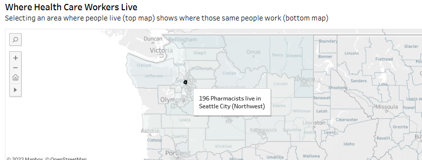
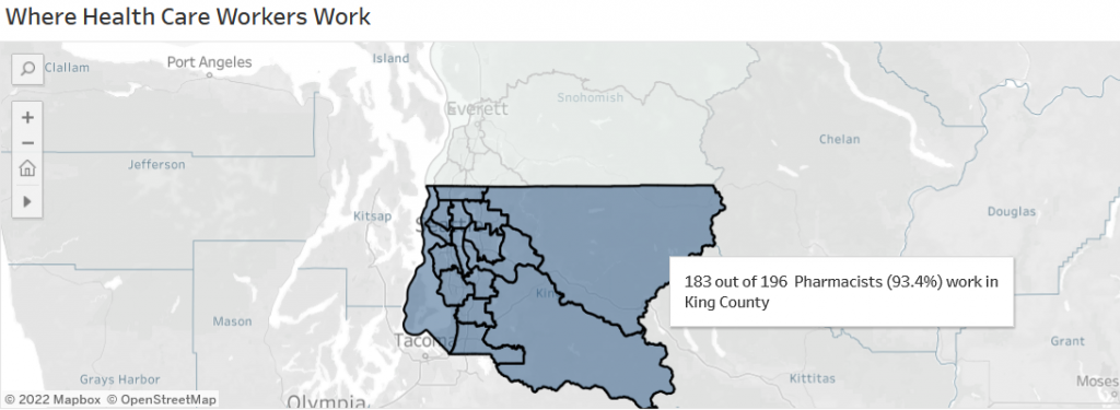
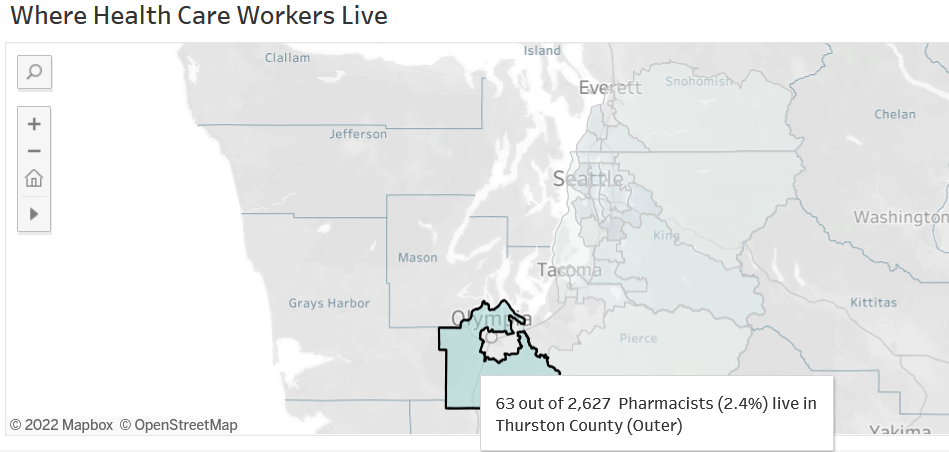
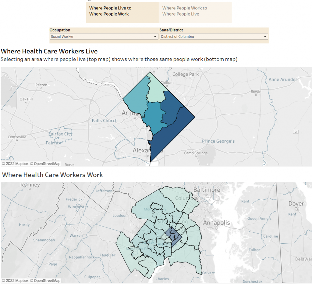
Example 1: Starting with where health care workers live
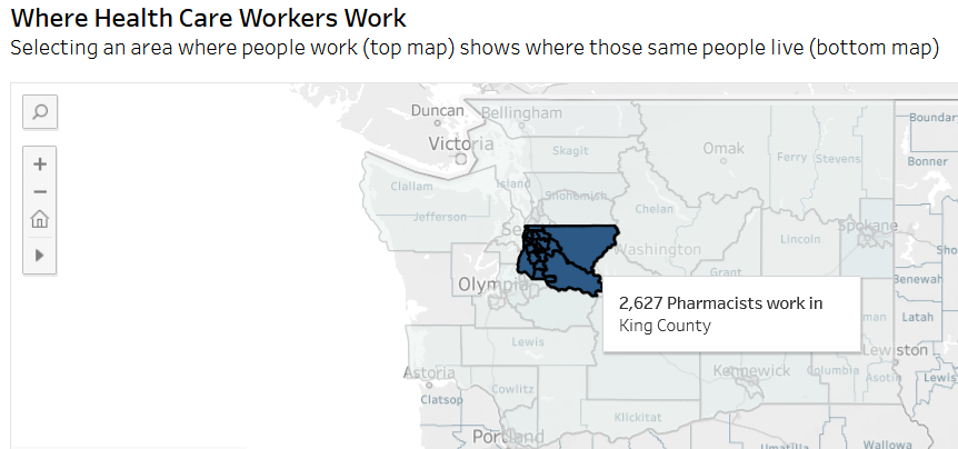
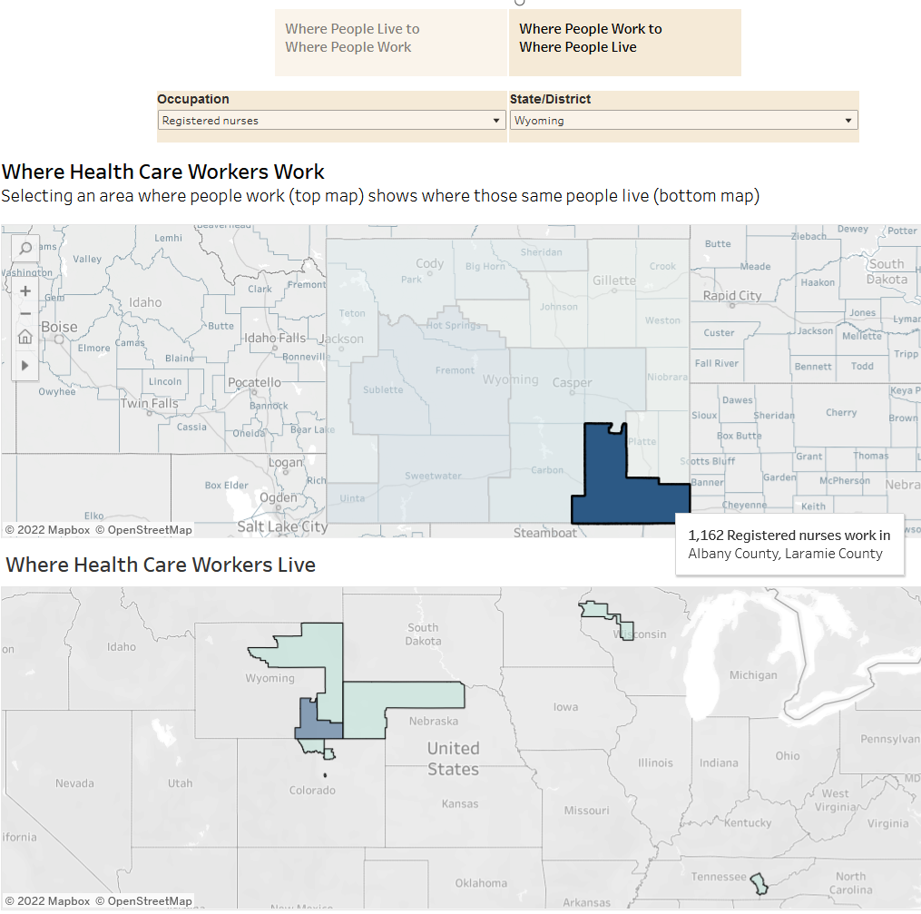
Example 2: Starting with where health care workers work
Example 3: Select multiple PUMAs to investigate commuting patterns
Example 4: Some health care workers live far from where they work
Suggested citation:
Stubbs BA, Zhi A, Dahal A, Skillman SM, Frogner BK. Workforce Dashboards: Commuting Patterns Dashboard. Center for Health Workforce Studies, University of Washington, 2022. https://familymedicine.uw.edu/chws/resources/commuting-patterns/