National Age Cohort Composition for 9 Allied Health Occupations From 2011 to 2017
This dashboard allows for comparison of age distributions within select health care occupations using data from the 2011, 2014, and 2017 American Community Survey. You may look at age distributions by percentage of workers within 5-year age increments, workers per 100,000 population in each age increment, and total workers in each age increment. You may also compare up to 3 occupations at the same time. To learn more about the data and the Workforce Dashboards more broadly, please read our FAQ page.
The following are a few example interpretations of the workforce data on select occupations including allied health from the Aging Trends Dashboard. To learn more about the data and the Workforce Dashboards more broadly, please read our FAQ page.
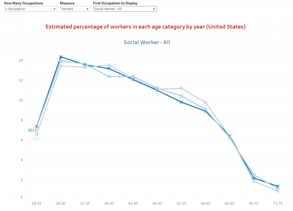
Example 1: Consistent age distribution of the health care workforce

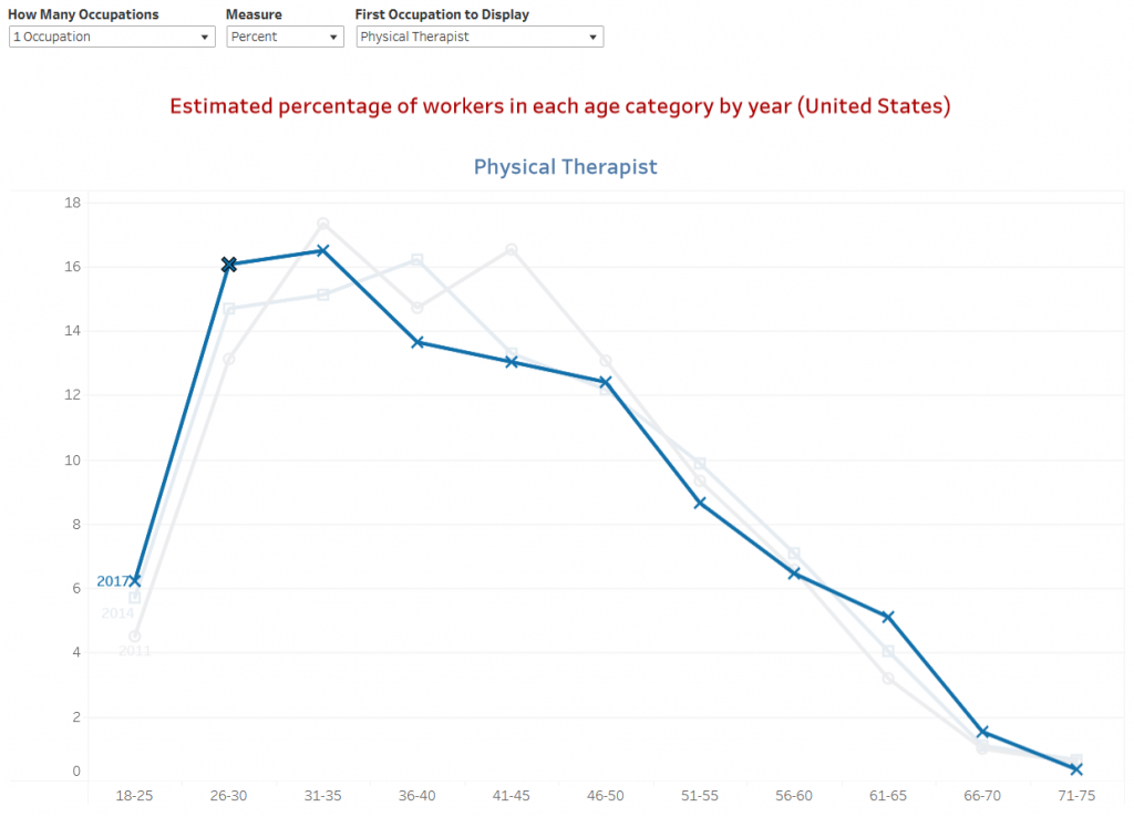
Example 2: Changing age distribution of the health care workforce

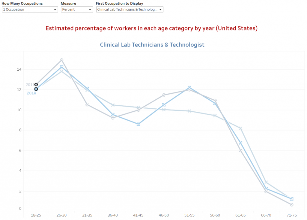
Example 3: Bimodal age distribution of the health care workforce

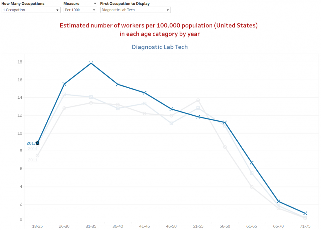
Example 4: Growing number of health care workers

Suggested citation:
Dahal A, Stubbs BA, Skillman SM, Frogner BK. Workforce Dashboards: Aging Trends Dashboard. Center for Health Workforce Studies, University of Washington, 2022. https://familymedicine.uw.edu/chws/resources/aging-trends/
